Spotify Canvas vs Apple Music Motion Art: One Loop, Both Platforms
The two moving covers compared: where each shows, frames and durations, how delivery differs, and the workflow that builds one design and ships it to both platforms.
Spotify and Apple Music both replaced the static cover with motion, but they did it differently, and the differences decide how you should work. Here is the honest comparison, and the workflow that means you only ever design the loop once.
Where each one lives
A Spotify Canvas plays behind a single track in the Now Playing view, and it follows the track when a listener shares it to Instagram Stories. Apple Music motion art is bigger-picture: it plays on your artist page and on album placements, more like a storefront than a per-track backdrop.
The spec differences that matter
- Frame: Spotify is one vertical 9:16 frame. Apple is two frames, square 1:1 and tall 3:4, with player UI covering the top and bottom of the tall one.
- Duration: Spotify wants 3 to 8 seconds. Apple accepts 8 to 35.
- Audio: both are silent, both loop forever, and both punish a visible seam.
- Delivery: Canvas uploads yourself in Spotify for Artists per track. Apple motion art ships through your label or distributor's motion program.
Full numbers live in the Spotify Canvas cheat sheet and the Apple motion art spec guide.
Design once, ship twice
The design work is identical: your cover, motion, maybe text. The frames are not. That is why LimePulse runs Canvas, for Spotify Canvas, and Motion, for Apple Music motion art, as two doors into the same studio: same layers, same ninety-plus effect cards, same 140 text animations, different frame math.
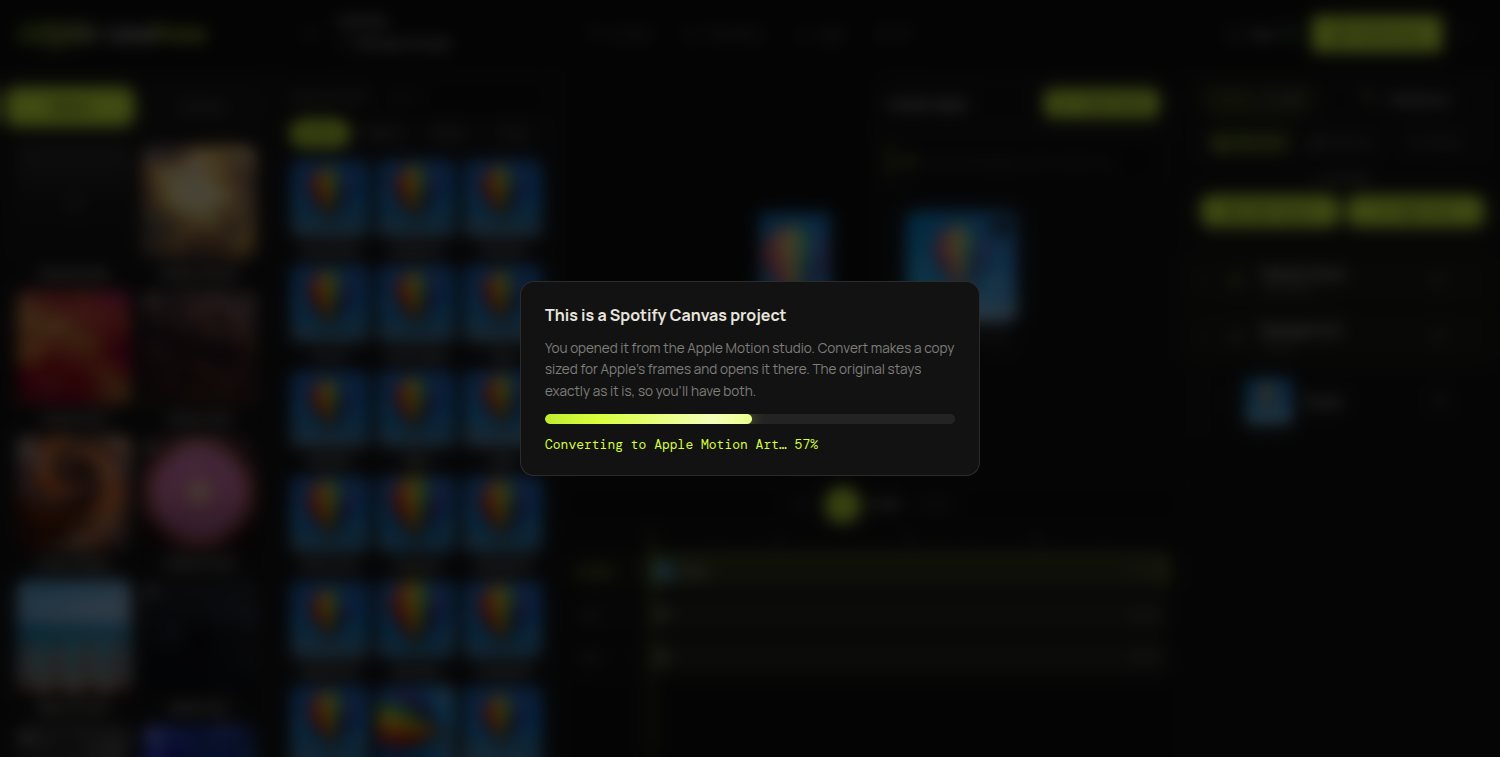
Build the Spotify Canvas first (the tighter 9:16 frame is the harder design problem), then open the project from Motion. LimePulse offers to convert a copy: layout re-framed for Apple, safe zones drawn in, original untouched. Two platform-ready loops, one design session.
Which should you make first?
If you can only do one this week: the Canvas, because it rides along on every story share of your track. But the whole point of the shared studio is that this is not really a choice. One Creator plan exports both, and the second platform costs you one click. Start with your cover, free.